Skip to Content

Common Mistakes New Website Owners Make and How to Avoid Them

January 12, 2026 by
Common Mistakes New Website Owners Make and How to Avoid Them
Narottam Bose


Launching a website feels a lot like setting up a little shop on the corner. You spruce up the place, arrange the stuff inside, flip the sign to "open," and cross your fingers that folks wander in. But if the sign's faded, the door sticks, or everything's a mess, they'll just shrug and head somewhere else.

A ton of newbies trip over the same easy-to-fix screw-ups. This rundown points them out so you don't have to learn the hard way and end up with a site that actually pulls its weight.

1. Skipping the Plan Altogether
It happens because picking colors and fonts is way more exciting than the boring upfront stuff. People dive right in without figuring out who's supposed to use the site or what it's even for.

That messes you up big time—you get something pretty that doesn't help anyone. Visitors hit the page, poke around, and bail because they can't tell how to grab what they want or reach out.

Take this bakery I heard about: killer cupcake pics everywhere, but no address, hours, or menu up front. Folks craving a snack get annoyed and bounce to the next spot online.


Fix it by:

Nailing down your main goal. Selling stuff? Hunting leads? Just dumping thoughts (like a blog)?

Roughing it out on paper first. Basics like Home, About, Services, Contact—boom, start there.

2. Picking a Platform That Doesn't Fit
New folks grab whatever's free or what their buddy swore by, no questions asked about if it matches what they need.

Problem is, you're locked into something that can't keep up. Free builders slap ads all over, or fancy coding ones leave you stuck when it's time to tweak things.

Picture an artist slapping together a basic portfolio on some e-commerce beast—they're shelling out $40 a month for junk they don't use and a dashboard that might as well be hieroglyphs.

Fix it with:

Blogs or writing? WordPress or Ghost.

Selling online? Shopify or WooCommerce.

Quick portfolio? Squarespace or Wix.
Search "best site builder for [whatever you're doing]" and don't commit blind.

3. Letting It Load Like a Snail
Blame huge un-squished photos that look awesome but weigh a ton, or junky hosting piled with gimmicky add-ons.

Nobody waits around. Over 3 seconds? Half your crowd's gone. Plus Google shoves slow sites to the back of the line.

Photographer dumps 50 massive raw pics in a gallery—takes 15 seconds on a phone. Buyer thinks it's busted and taps out.

Fix it:

Squash images with TinyPNG (free, keeps the quality).

Check speeds on Google PageSpeed Insights—it's quick and tells you what's dragging.

4. Forgetting About Phones
You build it on your laptop where it shines, overlooking that everyone's scrolling on their phone these days.

Suddenly text's tiny, buttons mash together, pics flop off-screen. Mobile peeps hit eject right away.

Freelancer's "Hire Me" button? Giant and perfect on desktop, but it smothers the text on mobile—no one can read the details.

Fix it:

Flip to mobile preview in your builder every few minutes.

Actually load it on your phone (and a friend's) to tap buttons and scan text for real.

5. Filling Pages with Vague Nonsense
Talking about your own stuff is tough, so you toss in fluffy lines like "we deliver top-tier results" or leave spots blank.

It kills trust—people need to get you in seconds or they're out.

Consultants brag about "future-proof synergies" but skip saying they handle tax filing for small shops. Duh.

Fix it:

Cut the crap: "We clean houses and offices in Chicago," not some vague promise.

Talk their language—what's in it for them, not your ego trip.

6. Blowing Off Basic SEO
SEO seems like nerdy rocket science, so beginners pretend it'll sort itself out.

Your site's live, but ghosts—no searches find it. You're hidden from the exact people hunting what you got.

Vintage clothes shop calls pages "Page 1" instead of "Retro Denim Jackets." Google shrugs.

Fix it:

Real titles: "Plumbing Fixes in Austin."

Slip in search words naturally—what would customers actually type?

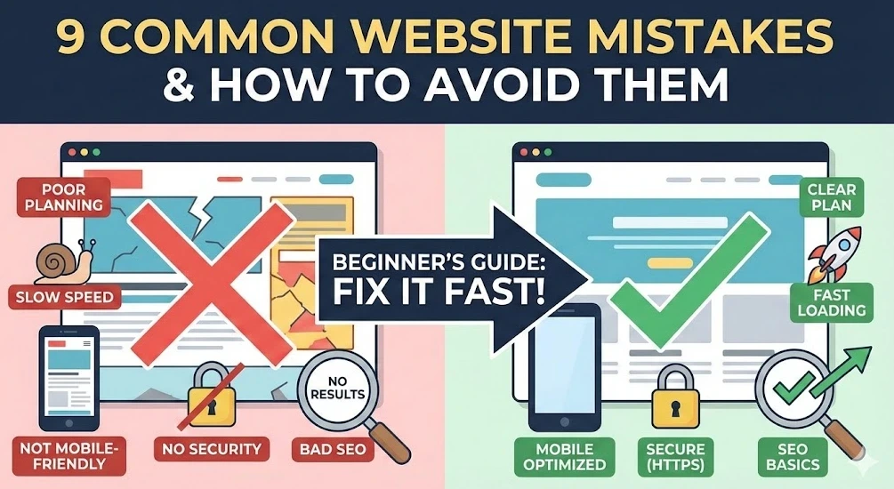
7. Skimping on Security

Small timers think, "Hackers ignore nobodies like me," and skip the SSL padlock thing.

Browsers scream "Not Secure!"—scares everyone, especially if you're collecting emails or cards.

Coaching site contact form? Red warning pops, form-abandoner freaks and bolts.

Fix it:

Grab SSL—Bluehost or SiteGround toss it in free. Make sure it's https:// everywhere.

8. Branding That's All Over the Place

No design know-how means grabbing random fonts, clashing colors, cheesy stock images.

Looks sketchy and amateur—trust evaporates.

Law firm? Serious font on home, cartoon scribbles on contact. Total clown show.

Fix it:

One main color, one backup, max two fonts (headers and body). Lock it in across the site.

9. No Way to Track What's Happening

You hit launch, pat yourself on the back, skip the analytics because graphs look intimidating.

Blind flying—you got no clue on visitors, hot pages, or bounce spots.

Blogger grinds on winter gardening posts, but data would've shown houseplants pull all the traffic. Wrong hill to die on.

Fix it:

Slap on Google Analytics now (free standard). Data piles up even if you're not glued to it yet.

Quick Launch Checklist

Before blasting this thing everywhere:

[1] Goal check: Stranger gets what you're about in 5 seconds flat?

[2] Mobile check: Tapped every button, read every page on a phone?

[3] Speed check: Squished pics, loads quick?

[4] Trust check: HTTPS secure, contact deets obvious?

[5] Search check: Page titles say what you do?

[6] Data check: Analytics tracking visits?


in News
Common Mistakes New Website Owners Make and How to Avoid Them
Narottam Bose January 12, 2026
Share this post
Tags
Archive
What's NFC all about?